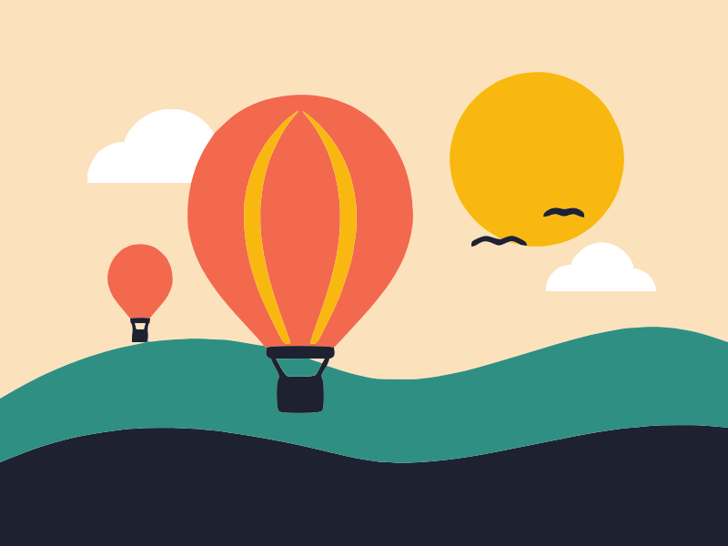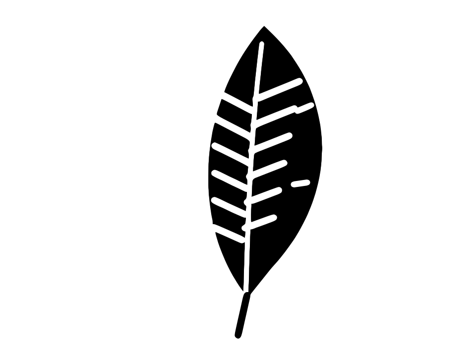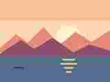
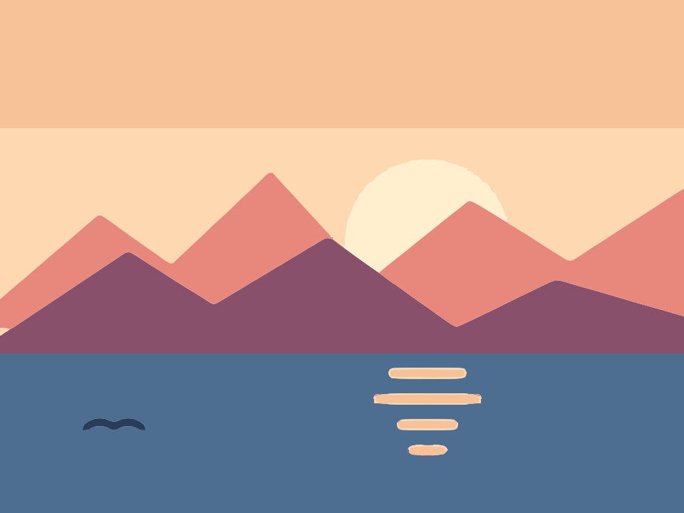
 Before · JPGAfter · SVG · 30 shapes
What happens when you convert a photo to vector
A photograph is made of millions of pixels with smooth, continuous changes in colour: soft shadows, skin tones, out-of-focus backgrounds, fine texture. Vector graphics work differently. An SVG made by tracing is a set of filled shapes, and each shape has one solid colour.
So when you convert a picture to vector, the tracer first reduces it to a small palette of flat colours and then draws an outline around each patch. Smooth gradients become distinct bands, and fine texture is either simplified into larger shapes or dropped. The technical name for this look is posterisation.
Let us be clear about what this tool does not do. It does not produce a realistic, photo-quality SVG, it does not use AI to reinterpret or upscale your picture, and the output contains no gradients. What it does well is turn a photo into deliberate, graphic art: screen-print posters, stencils, silhouettes, sticker designs and cut files.
How to turn a photo into an SVG
- Pick a photo with a clear subject and good contrast, and crop it so the subject fills most of the frame.
- Drop it on the converter above, or paste it with Ctrl+V (Cmd+V on a Mac). It starts in Colour mode with 6 colours, a good starting point for a poster look.
- Open the photo in the editor to experiment: try 3, 4 or 5 colours for a bolder style, or switch to Black & white for a stencil.
- Raise Ignore less than until the background clutter and tiny specks disappear.
- Click Download SVG, or Copy SVG to paste it into your design tool.
Photos often contain people, places and private moments. Here they are never uploaded: the picture is traced inside your browser, and nothing is sent to a server.
Which photos make good vector art
Some pictures turn into striking vector art and some turn into noise. The difference is mostly in the photo, not the settings.
| Works well | Struggles |
|---|---|
| One clear subject: a face, a pet, a building, an object | Busy scenes with lots of small elements |
| Strong lighting with distinct light and shadow | Flat, overcast light with little contrast |
| Plain or blurred background | Detailed backgrounds such as foliage or crowds |
| Subject against the sky or a wall (silhouettes) | Subject the same colour as the background |
| Large, sharp image | Small, heavily compressed images |
A little preparation in any photo editor helps a lot: crop tightly, increase contrast, and if you can, remove or blank out the background before tracing.
Poster-style vector art in Colour mode
The Number of colours is the main creative control. It decides how many flat tones the picture is reduced to.
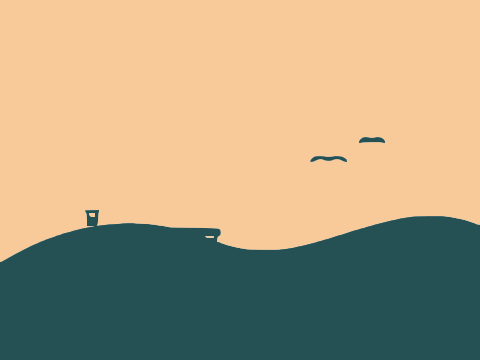
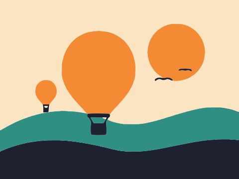
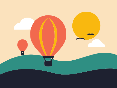
- 2 to 3 colours: a graphic, high-impact look, close to a two-colour screen print.
- 4 to 6 colours: the classic pop-art portrait. Faces keep their shape, with a highlight, mid-tone and shadow.
- 8 to 12 colours: more recognisable detail, but many more shapes and a heavier file.
With the default Output of Separate shapes, every colour patch is its own path, cut out exactly, so neighbouring shapes meet without gaps or overlaps. That makes it easy to recolour the result by hand, for example turning a portrait into an orange-and-navy poster. Stacked layers gives one path per colour instead, stacked dark to light, which is handy when each colour will become a separate print screen or vinyl layer.
If the background is not part of the design, Remove background drops the regions that touch the edge of the image.
Stencils and silhouettes in Black & white mode
For a one-colour result, switch to Black & white in the editor. Every pixel is classified as dark or light, and the dark parts become filled shapes. This is the quickest way to make a stencil, a silhouette or a single-colour cut file from a picture.
- Threshold starts at an automatic value chosen for your photo, with a histogram to guide you. Move it right to make more of the image dark (heavier shadows), left to keep only the deepest darks.
- Blur softens texture such as skin pores, fur or grain before thresholding, so the shapes come out bolder and smoother.
- Invert image swaps dark and light, useful for a subject that is lighter than its background.
Switch the preview to Processed image to see the black and white mask before it is traced. When the mask looks right, the vector will too. A silhouette shot, a person or a tree against a bright sky, gives an almost perfect outline with the automatic threshold.
Removing clutter and keeping file size down
Photos produce far more shapes than logos do. A few settings keep the result clean:
- Ignore less than is the most useful one. The default of 2 px² keeps almost everything. For photos, try 20, 50 or even 100 px² to remove speckles and isolated islands of colour.
- Smoothness near the top of its range (up to 1.34) gives rounder, more organic outlines that suit faces and animals.
- Curve optimisation set higher than 0.2 fits looser curves with fewer nodes, which shrinks the SVG.
- Max size of 1024 px is often plenty for stylised art. Smaller tracing size means less fine noise and a lighter file. Phone photos are scaled down to 2048 px by default anyway.
The status line in the editor shows shape and node counts and the file size in KB, so you can compare settings quickly.
Ideas for photo vector art
- Pet portraits as flat art for mugs, T-shirts or framed prints. Crop to the head and try 4 or 5 colours.
- Stencils for spray paint, screen printing or wall art, made in Black & white mode.
- Silhouettes of people, skylines or trees for signs and decorations.
- Cut files for vinyl or paper: see Image to SVG for Cricut and SVG for laser cutting.
- Posters and album art with a deliberately limited palette.
For graphics rather than photos, the general Vectorize image page and the JPG to SVG converter cover the details.
Frequently asked questions
Can I convert a photo to SVG for free?
Yes. Image Tracer is free and open source, with no account, no watermark and no limits. Your photo is processed in your browser and never uploaded.
Will the SVG look exactly like my photo?
No. Tracing turns a photo into flat areas of colour, so the result is stylised, poster or stencil-like art rather than a realistic copy. Gradients and fine texture are simplified into solid shapes.
How many colours should I use for a photo?
Start with 4 to 6. Fewer colours give a bolder graphic style and a smaller file; more colours keep more detail but add many small shapes. For a one-colour stencil, use Black & white mode.
How do I make a stencil from a picture?
Switch to Black & white mode, adjust the Threshold until the shadows look right in the Processed image view, add a little Blur to smooth texture, and raise Ignore less than to remove specks.
Does it use AI to convert pictures to vector?
No. It uses a Potrace-inspired tracing engine that follows the edges in your image. It does not invent detail, upscale or redraw the photo.
Why is my photo SVG file so large?
Photos have lots of small details, and each becomes a shape. Lower the number of colours, raise Ignore less than and Curve optimisation, or trace at a smaller Max size.
Last updated