 Before · PNGAfter · SVG · 39 shapes
Why you need a vector version of your logo
Sooner or later, someone asks for your logo "in vector format". A printer making signage, an embroidery shop, a designer building a website, a merch supplier. They need it because a vector logo is made of shapes, not pixels: it prints sharp on a business card and on a banner, and every colour and letter can be edited.
If all you have is the PNG from your website or a JPG from an old email, you can rebuild the vector version by tracing it. For simple, flat logos, which most are, tracing gives a result that is ready to use.
How to vectorize a logo
- Find the largest, cleanest copy of the logo you have. A big PNG beats a small JPG every time.
- Drop it on the converter above. It starts in Black & white mode, which is ideal for one-colour logos and wordmarks.
- Check the letters at full size. If thin strokes break up or counters (the holes in a, e, o) fill in, open it in the editor and move the Threshold.
- For a logo with several colours, switch to Colour mode in the editor and set the number of colours to match your logo.
- Download the SVG and open it in your vector editor to check and adjust.
For a complete walk-through, including how to rebuild a logo from a blurry screenshot, see How to vectorize a logo.
Sharp corners and clean curves
The hardest part of logo tracing is corners. Pixel images soften every edge with anti-aliasing, so a naive tracer rounds every corner off, and the tip of an A or the end of a square serif goes blobby.



Image Tracer keeps corners between straight edges exact and rebuilds corners that anti-aliasing has softened. Straight lines stay straight, and curves stay smooth where the logo is meant to be round.
You can shift the balance with Smoothness. Lower it for geometric logos made of straight lines and hard angles. Raise it for script lettering and organic shapes. The default of 1 is a good middle ground for most wordmarks.
Every letter is its own shape
In both modes, each visually separate shape becomes its own <path>, with its own holes. In a wordmark that means each letter is a separate path, and so is the dot of an i or a small symbol next to the name.
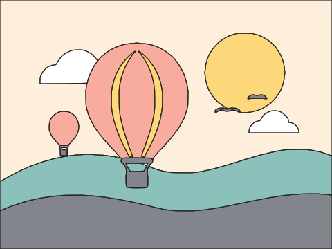
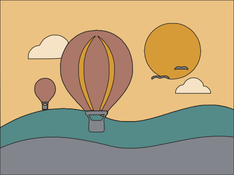
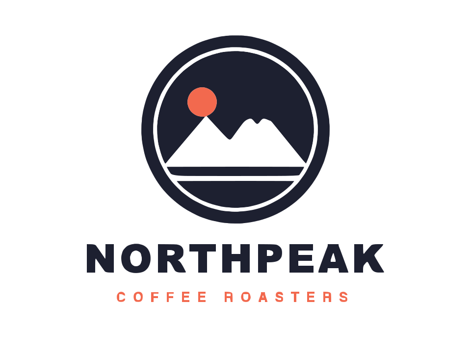
The example above shows a coffee-roaster badge logo: it traces to 39 separate shapes (the badge, the mountains and every letter of the name and tagline) with 832 nodes in total. In practice this saves a lot of work:
- Move a letter to fix spacing without breaking anything apart.
- Recolour a single mark or word.
- Delete a tagline you do not need for a small version of the logo.
Holes are real holes. The inside of an O or a ring around a symbol is cut out, not covered with a white patch, so the logo works on any background colour.
Colour logos
For a logo with two or more flat colours, switch to Colour mode in the editor:
- Set Number of colours to the colours in your logo, plus one for the background. A red-and-navy logo on white is 3.
- Turn on Remove background so the white area around the logo is dropped.
- Keep Output on Separate shapes. Each colour region becomes its own path and neighbouring shapes share exact edges, so there are no gaps or overlaps.
Fill colours are measured from the inside of each region, but they are still read from your image. If you have official brand colour values, set them on the paths in your vector editor afterwards.
Gradients, shadows and glows do not survive tracing as effects; they turn into flat bands. If your logo has them, a flat version will trace better. Black & white vs colour tracing explains the trade-offs.
Recommended settings for logos
| Logo type | Mode | Settings to try |
|---|---|---|
| Black wordmark or monogram | Black & white | Defaults; adjust Threshold if strokes look too thick or thin |
| White logo on dark background | Black & white | Tick Invert image |
| Geometric, angular logo | Either | Lower Smoothness |
| Script or hand-lettered logo | Black & white | Default or slightly higher Smoothness |
| Two to five flat colours | Colour | Matching colour count, Remove background on |
The Threshold starts at an automatic value worked out for each image and shows a histogram. Moving it right makes more of the image count as dark (thicker strokes); moving it left makes strokes thinner.
Tips for a professional result
- Crop tight. Remove unrelated content around the logo before tracing.
- Trace big. If the logo is small in the image, raise Max size or use a larger source so small text keeps its shape.
- Check the node count. Turn on Show points. Clean logos need surprisingly few nodes. If you see clusters, raise Curve optimisation a little.
- Retype small text. Tiny taglines rarely trace perfectly. If you know the font, setting the text again in your vector editor is often cleaner.
What you get
A plain SVG with one filled path per shape, using lines and quadratic Bézier curves and fill-rule="evenodd" for holes. It opens in Illustrator, Inkscape, Figma, Affinity Designer and browsers, and can be used directly on the web. If your printer needs a PDF or EPS, open the SVG in a vector editor and export from there; Image Tracer itself saves SVG only.
Frequently asked questions
Can I convert a logo to vector for free?
Yes. Image Tracer is free and open source, with no account, no watermark and no limits. The logo is traced in your browser and never uploaded.
Will my vectorized logo have sharp corners?
Yes. Corners between straight edges are kept exact, and corners softened by anti-aliasing are rebuilt. Lower Smoothness if you want an even more angular result.
Can I edit individual letters afterwards?
Yes. Every visually separate shape is its own path, so each letter, dot and symbol can be selected, moved or recoloured on its own in any vector editor.
Does it work for colour logos?
Yes. Switch to Colour mode in the editor, set the number of colours to match your logo, and turn on Remove background. Each colour region becomes its own shape.
Can I get my logo as EPS, AI or PDF?
Image Tracer exports SVG only. Open the SVG in a vector editor such as Inkscape or Illustrator and save it in the format you need.
My logo is a blurry, low-resolution image. Will this work?
Tracing follows the pixels it is given, so very small or blurry logos lose detail. Find the largest copy you can. For badly degraded logos, the trace is a good base to clean up by hand.
Last updated