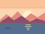
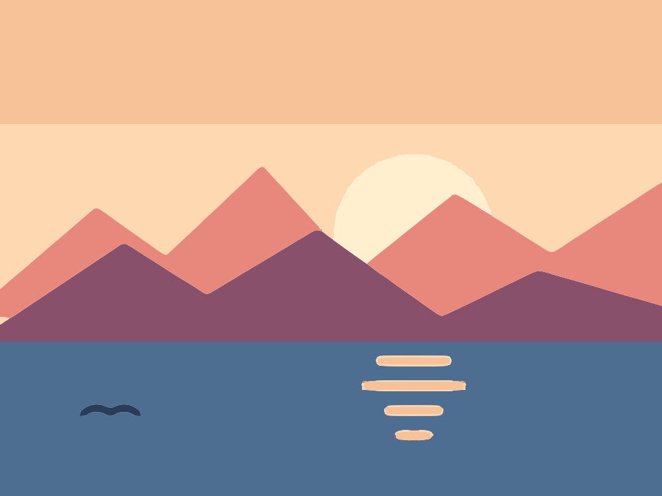
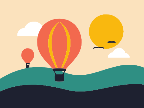
 Before · JPGAfter · SVG · 30 shapes
How Black & white tracing works
Black & white mode reduces the image to a single yes-or-no question per pixel: is it darker than the threshold?
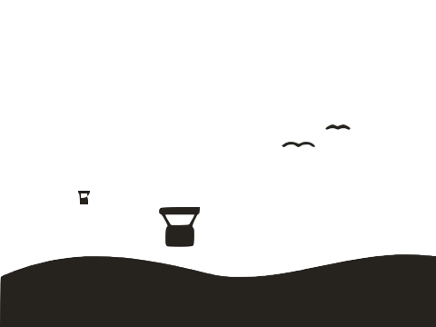
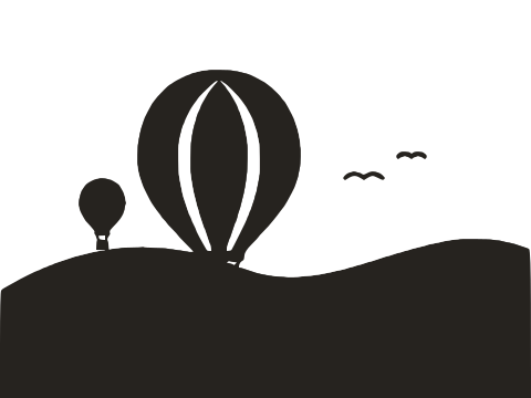
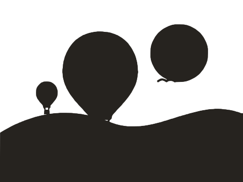
- The image is converted to greyscale. Transparent pixels are composited onto white first.
- An optional Blur softens noise.
- Every pixel darker than the Threshold becomes ink; everything else is background. Invert flips that.
- The outlines of the ink areas are traced and fitted with lines and curves, and each separate shape, holes included, is written as its own black path.
Colour information is thrown away at step one. A red logo and a navy logo of the same brightness give the same mask. That sounds like a limitation, but it is what makes this mode so robust: there is only one decision to get right, and the Processed image preview shows you exactly how it was made.
How Colour tracing works
Colour mode answers a harder question: which of a few colours does each pixel belong to?
- The image is reduced to a palette of up to Number of colours using colour quantisation. Similar shades are grouped, and each group gets one representative colour.
- Anti-aliased edge pixels, the in-between shades that make edges look smooth on screen, are recognised as blends of their neighbours and reassigned, rather than becoming thin outline shapes of their own.
- Regions smaller than Ignore less than are merged into the surrounding colour.
- Each fill colour is measured from the interior of its regions, so it matches the flat colour you see rather than the blended edges.
- The regions are traced into paths, either as separate shapes or as stacked layers.
Fully transparent pixels are not assigned to any colour, so a transparent PNG keeps its transparency in the SVG. The lake illustration at the top of this page comes out as 30 shapes and 577 nodes in a 14.8 KB file.
Separate shapes vs Stacked layers
The Output setting in Colour mode controls how regions become paths. The difference matters a lot once you open the file elsewhere.
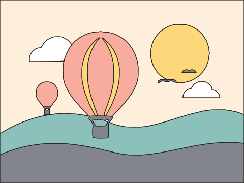
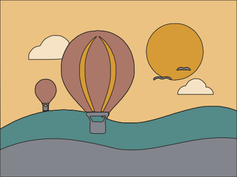
Separate shapes (the default) is a cut-out: every connected region of every colour is its own path, with real holes where other shapes sit inside it. Neighbouring shapes share exactly the same edge, so they fit like jigsaw pieces with no overlap and no hairline gaps.
Stacked layers writes one path per colour, ordered from darkest to lightest. Each layer covers its own colour and every lighter colour, and the lighter layers are painted on top. Visually the result is the same; structurally it is a pile of overlapping sheets.
| Separate shapes | Stacked layers | |
|---|---|---|
| Paths | One per region; can be many | One per colour; few |
| Overlap | None, true cut-outs | Every layer overlaps the ones below |
| Edit one shape | Select it and move, recolour or delete | Need to split the colour path first |
| Recolour a whole colour | Select all shapes of that colour | One click on its layer |
| Cutting machines and lasers | Ideal: each piece cuts once | Poor: overlapping layers cut through each other |
| Remove background | Supported | Not available |
| Deleting a shape | Leaves a clean hole | Reveals the darker layer underneath |
Use Separate shapes unless you specifically want one path per colour, for example to recolour a palette quickly in a design tool or to hand a developer an SVG where each colour is a single element.
Choosing the number of colours
The setting is a ceiling, not a target: Image Tracer merges colours that are practically identical, so a three-colour image traced with 8 still gives three colours. But a ceiling that is too high lets shading and noise claim their own colours, and one that is too low merges colours you wanted to keep.
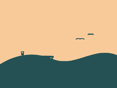
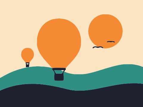
- Count the flat colours, then add one for the background. A red and black logo on white needs 3.
- Watch the swatches. The palette under the setting shows what was found. If a brand colour is missing, add one. If you see two near-identical greens, or a muddy tint that only exists along edges, take one away.
- For cartoons and flat illustrations, 6 to 12 is typical. Much beyond that, extra colours tend to go to shading and edge noise rather than real colours.
- For photos, more colours means more realistic but much heavier files. Even at 32 the result is a posterised, poster-like image, not a photo.
Removing the background
Remove background drops the regions of the most common border colour that touch the edge of the image. A sticker on white becomes a sticker on nothing. Regions of the same colour enclosed by the artwork, like white eyes on a character, stay.
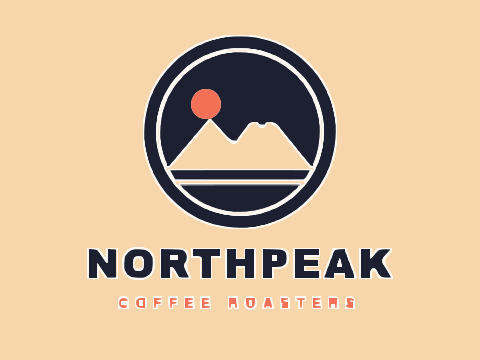
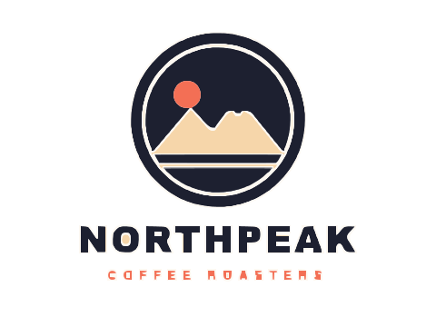
It assumes the background reaches the image border. If your artwork touches the edges, or the background is a busy photo, crop or clean the image first. In Black & white mode you do not need this setting at all, because only ink is drawn.
File size and node count
Every shape and every node adds bytes, and complex files are slower to render and tedious to edit. The two modes behave differently here.
- Black & white is usually the lightest. Only one set of outlines exists: the edges between ink and paper.
- Colour with Separate shapes traces each boundary once and shares it between both neighbours, but every boundary between two colours still needs describing, and each extra colour adds boundaries.
- Colour with Stacked layers has fewer paths but redraws outlines on each layer, because every layer extends underneath its lighter neighbours.
To slim a colour trace, reduce Number of colours first, since it has the biggest effect, then raise Curve optimisation and Ignore less than. The status line shows the KB, shape and node counts after each change, so you can see what each step saves.
Decision checklist
Go through these in order and stop at the first that applies.
- Is the artwork one colour, or will you recolour it anyway? Use Black & white.
- Is it text, a signature or line art? Use Black & white, even if the ink is blue: the shapes will be cleaner. See Signature to SVG.
- Is it light artwork on a dark background, in one colour? Black & white with Invert.
- Does it have several flat colours that must be preserved? Colour, Separate shapes, Number of colours set to your count plus background.
- Is it for a cutting machine or laser? Colour with Separate shapes and Remove background, or Black & white for single-colour cuts. See Image to SVG for Cricut.
- Do you want one element per colour for styling or recolouring? Colour with Stacked layers.
- Is it a photograph? Colour gives a posterised, stylised result. If you need photographic realism, keep it as a raster image.
Still unsure? Try both: switching tabs re-traces immediately with your other settings kept. For per-image-type recommendations see Best settings for image tracing.
Frequently asked questions
Why does Black & white mode ignore my colours?
It works on brightness only: every pixel is either darker than the threshold or not. Use Colour mode to keep colours, or trace in Black & white and recolour the separate shapes in a vector editor.
Why do I get fewer colours than I asked for?
Number of colours is a maximum. Colours that are practically identical are merged, and in-between edge shades are folded into their neighbours rather than kept as colours of their own.
Which output should I use for Cricut or Silhouette?
Separate shapes. Each region is one closed path with no overlaps, so every piece cuts once. Stacked layers overlap, so the machine would cut through shapes underneath.
Does colour mode produce gradients?
No. Every shape has one flat fill colour. Gradients and soft shading become bands of flat colour; fewer colours give fewer, broader bands.
Which mode makes smaller files?
Black & white, almost always. In Colour mode, lowering the number of colours is the most effective way to reduce size.
Last updated