
 Before · PNGAfter · SVG · 7 shapes
Recipes by image type
Start from the defaults (click Restore default settings in the editor), then change only what the recipe lists. Anything not mentioned stays at its default: automatic threshold, Blur 0, Ignore less than 2, Smoothness 1, Curve optimisation 0.2, Max size 2048, and 8 colours with Separate shapes in Colour mode.
| Image | Mode | Change from the defaults | Why |
|---|---|---|---|
| Logo, one colour | Black & white | Smoothness 0.7–1; Curve optimisation 0.3–0.5 | Crisp corners and fewer, cleaner nodes |
| Logo, several colours | Colour | Number of colours = colours in the logo + 1; Remove background if needed | One swatch per brand colour, nothing extra |
| Text and lettering | Black & white | Smoothness 0.8; Curve optimisation 0.1–0.2; Max size 4096 for small type on a large page | Keeps serifs and counters intact |
| Signature | Black & white | Threshold slightly higher for light ink; Blur 0.5–1 for photos; Ignore less than 10–30; Smoothness 1.1 | Continuous strokes, no paper specks, fluid curves |
| Sketch or ink drawing | Black & white | Blur 1–1.5; Ignore less than 10–50; Smoothness 1–1.2 | Removes paper grain and smooths hand-drawn edges |
| Pixel art | Colour (or B&W) | Enlarge 8× with nearest-neighbour first; Smoothness 0; Curve optimisation 0–0.1; Ignore less than 0 | Square pixels stay square, nothing is dropped |
| Flat illustration or cartoon | Colour | Number of colours 6–12 | Enough colours for the artwork, not for the shading |
| Sticker or cut file | Colour | Separate shapes; Remove background; Ignore less than 20+; Curve optimisation 0.4–0.6 | Clean, closed pieces that cut smoothly |
| Scanned document | Black & white | Ignore less than 5–20; Max size 4096; lower Threshold if the paper is grey | Sharp type without scanner noise |
| Photograph | Colour | Number of colours 8–16; Max size 1024; Ignore less than 20–100; Curve optimisation 0.5+ | Gives a stylised, posterised result; see below |
A note on pixel art
Image Tracer keeps corners between straight edges of three pixels or more exactly where they are, and smooths shorter steps into diagonals and curves, because short staircases are usually how pixels approximate a curve. At 1 screen pixel per art pixel, every step is a single pixel and gets smoothed. Enlarge the image first in any editor, using nearest-neighbour (no interpolation) at 8× or so, and every art pixel becomes a block whose corners are preserved, even at the default Smoothness. Images are never enlarged automatically.
A note on photographs
Photos do not trace well, and no setting changes that. Tracing turns an image into flat-coloured regions; a photo is mostly smooth gradients and fine texture. You will get a posterised, poster-art look with many shapes and a heavy file, sometimes larger than the original JPEG. That can be a deliberate style. If you want the photo to look like a photo at any size, keep it as a raster image. More on this in JPG to SVG.
The trade-off behind each setting
Every setting balances two things you want. Understanding which two makes fine-tuning quick. Full reference details, ranges and defaults are in the documentation.
Threshold: thickness versus cleanliness
A higher Threshold lets lighter pixels count as ink, so faint lines survive and strokes get heavier, but shadows, tints and paper grain start to appear. A lower one gives a cleaner background and thinner lines at the risk of breaking faint strokes. The automatic value is a balanced split for the image, so move it a few steps at a time and watch the Processed image view.
Blur: smooth edges versus fine detail
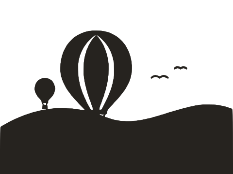
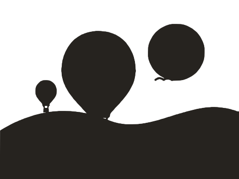
Blur erases noise before it can become nodes, which gives smoother edges and fewer specks. The price is detail: corners round off, close lines merge, small holes fill in. Use the smallest blur that makes the noise disappear in the processed image, often between 0.5 and 1.5.
Ignore less than: tidiness versus small details
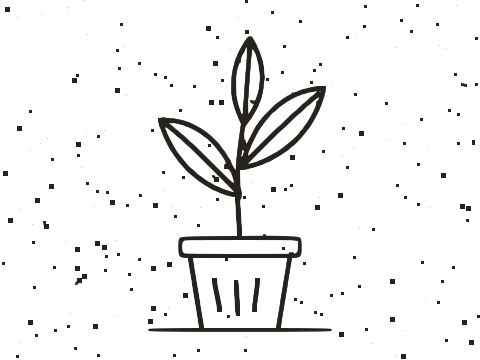
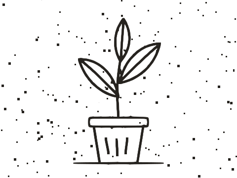
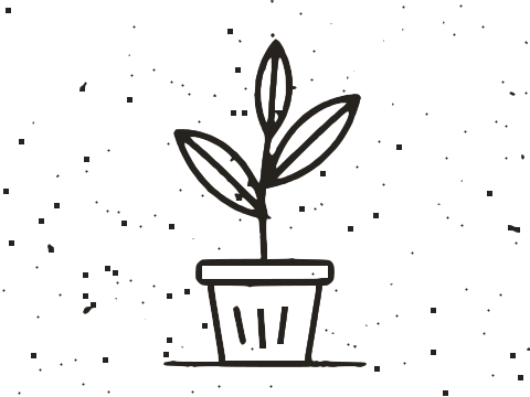
Ignore less than is a size filter. Raising it removes dust and pinholes; it also removes full stops, the dots of a stipple, and tiny highlights. Raise it until the shape count in the status line stops falling sharply. Because the area is in square pixels of the traced image, the right value depends on the Max size: a bigger working image needs a bigger value to remove the same dust.
Smoothness: sharp corners versus flowing curves
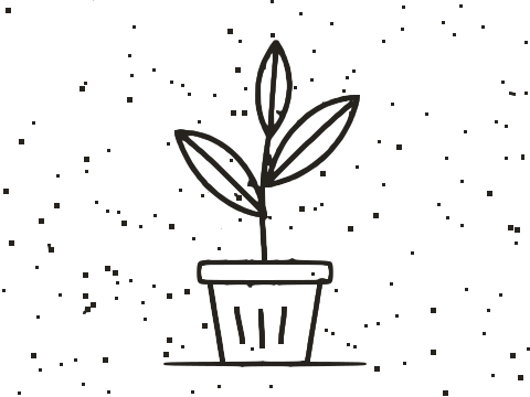
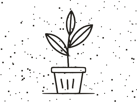
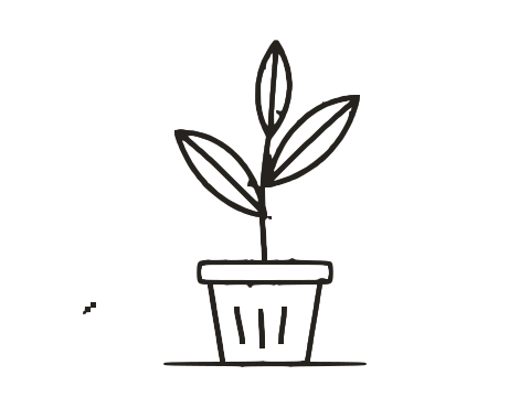
Smoothness picks which turns become corners. Low values keep every join sharp but make curves look slightly faceted; high values give fluid curves but can soften corners that should be crisp, and at 1.34 even right angles round off. Geometry wants it lower, hand-made artwork wants it higher.



Curve optimisation: accuracy versus simplicity
Curve optimisation sets how far the outline may deviate from the pixels in exchange for fewer nodes. Low values reproduce every bump, including bumps you did not want. High values give light, easy-to-edit files but distort small shapes first. For large, simple artwork you can push it to 0.5 or more; for small text keep it near the default.



Max size: detail versus speed
A larger Max size traces more pixels, so fine detail survives, but tracing takes longer and the file usually grows. A smaller one is faster and naturally smooths away noise, at the cost of detail. The default of 2048 suits most images; raise it for large scans with fine lines, lower it for quick experiments.
Number of colours: fidelity versus simplicity
More colours represent the image more faithfully, but each extra colour adds shapes, boundaries and bytes, and beyond the real palette they mostly pick up shading. Fewer colours give bolder, cleaner, lighter files. Match the count to the colours you would name if describing the image. Black & white vs colour tracing explains how colours are chosen.

How to judge a trace
A trace can look perfect at fit-to-window size and fall apart at 400%. Check these before you download.
Zoom in on the hard parts
Look at the smallest details, sharpest corners and tightest curves: the dot of an i, a serif, the point where two lines meet. If they hold up, everything else will. Turn on Fade image to compare against the original and check that line weights match.
Look at the points
With Show points on, every node is a dot. Good traces put nodes at corners and space them evenly along curves. Clusters on smooth edges mean noise is being traced: add Blur, raise Curve optimisation, or use a bigger source. Too few nodes on a curve that looks flat means Curve optimisation is too high.
Check the numbers
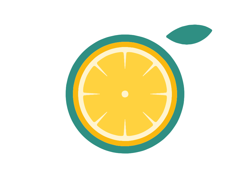
The status line reports KB, shapes and nodes. For reference, at default settings the lemon-slice sticker at the top of this page traces to 7 shapes and 764 nodes in 21.8 KB, and a 1000×340 px handwritten signature to 13 shapes and 1,405 nodes. A simple logo running to hundreds of kilobytes, or with hundreds of stray shapes, is a sign something needs adjusting.
- Shapes far higher than the number of objects you can see: raise Ignore less than.
- Nodes high for simple artwork: raise Curve optimisation or add a little Blur.
- KB larger than the original image: expected for photos, a warning sign for logos and icons.
Test it where it will be used
Open the SVG in the tool it is for: your cutting software, your vector editor, the web page. Every shape is its own path, so if a part needs fixing, select and edit it directly. For logos specifically, see How to vectorize a logo; for scans, How to vectorize a scanned drawing.
Frequently asked questions
What are the best settings for a logo?
Black & white mode with the automatic threshold, Smoothness around 0.7–1 and Curve optimisation 0.3–0.5. For multi-colour logos use Colour mode with the number of colours set to the logo's colours plus one for the background.
Which setting reduces file size the most?
In Colour mode, Number of colours. In both modes, Curve optimisation and Ignore less than come next. Lowering Max size also helps on very large images.
Why does my pixel art come out smooth and blurry?
At one screen pixel per art pixel, each step is a single pixel and is smoothed like a curve. Enlarge it 8× with nearest-neighbour scaling first, then trace with Smoothness 0.
Can I trace a photo into a realistic vector?
Not realistically. Image Tracer uses flat colours with no gradients, so photos become posterised art with many shapes. That works as a stylised effect, not as a faithful copy.
Do settings carry over to the next image?
Yes. Removing or replacing the image keeps your settings, except the threshold, which is recalculated automatically for each new image. Restore default settings resets everything.
Last updated