 Before · PNGAfter · SVG · 39 shapes
Prepare the source image
The trace can only be as good as the pixels it starts from. Ten minutes spent finding a better source saves an hour of fixing curves afterwards.
Find the largest version you can
Search old email threads, the website's full-size header image, social media profile uploads, PDF brochures and the original designer's handover folder. A logo that is 2000 px wide traces far better than a 200 px favicon, because every curve is described by more pixels. As a rule of thumb, aim for at least 1000 px across the widest part of the logo.
If the only version is in a PDF, zoom in heavily before taking a screenshot, or export the page as a high-resolution PNG. Screenshots at 100% zoom throw away detail you could have had for free.
Get a flat, plain background
The tracer separates logo from background by brightness (in Black & white mode) or by colour (in Colour mode). Both work best when the background is one flat colour with good contrast.
- Crop away anything that is not the logo: page edges, other text, photo backgrounds.
- A transparent PNG is ideal. In Black & white mode transparency counts as white, and in Colour mode transparent areas are simply left out of the SVG.
- If the logo sits on a photo or a gradient, put it on white in any image editor first, or expect to delete the background shapes afterwards.
Prefer PNG to JPEG
JPEG compression leaves faint blotches around sharp edges. They are easy to miss by eye but they become bumps in the trace. If you have both, use the PNG. If you only have a JPEG, a little Blur (see below) usually cleans it up.
Black & white or colour?
Most logos are simpler than they look. Decide by what the final file needs to be, not by what the source happens to look like.
- Use Black & white for single-colour logos, wordmarks, and any logo you will recolour later. You get the cleanest edges and the fewest nodes, and in a vector editor recolouring a black logo takes one click.
- Use Colour when the logo has two or more flat colours that must stay separate, such as a blue mark beside a grey wordmark. Set Number of colours to the number of colours you can count plus one for the background.
A useful trick for two-colour logos: trace in Black & white to get the sharpest possible shapes, then recolour the individual shapes in your editor. Because each letter and each part of the mark is its own path, that is quick. The trade-offs are covered in more depth in Black & white vs colour tracing.
Step by step
- Open the image. Open Image Tracer and drop your logo onto the page, or copy it and paste with Ctrl+V / Cmd+V.
- Pick the mode. Black & white for one colour, Colour for several.
- Check the mask (Black & white). Switch the preview to Processed image. The logo should be solid black on white with clean edges. If thin parts are breaking, raise the Threshold a little; if letters are clogging up, lower it. If the logo is white on a dark background, turn on Invert image.
- Check the palette (Colour). Look at the swatches under Number of colours. Each brand colour should have exactly one swatch. Add a colour if two are being merged; remove one if a shadow or edge tint has its own swatch. Turn on Remove background if you want the logo on a transparent canvas.
- Tune corners and curves. Switch back to Traced vector and adjust Smoothness and Curve optimisation as described in the next section.
- Inspect. Zoom into corners and small details, with Show path and Show points on.
- Export. Click Download SVG. The file is named after your image.
Changes re-trace automatically, so you can move a setting and judge the result in a second or two. Keep notes of what worked: brand logos often come in several variants that will need the same settings.
Crisp corners and clean curves
Logos are usually a mix of geometry (straight stems, sharp serifs, perfect squares) and deliberate curves (bowls of letters, swooshes). Two settings control how each is drawn.
Smoothness: where corners stay corners
Smoothness decides whether each turn in the outline becomes a corner or a curve. The default of 1 suits most logos. Image Tracer also keeps corners between straight edges exact and rebuilds corners that anti-aliasing has softened, so a square letter E stays square without any tweaking.



- Geometric logo, slab serifs, stencil type, or chamfered corners being rounded: lower Smoothness to 0.6–0.8.
- Script logo or hand-drawn mark with no hard corners: raise it to 1.1–1.25 so small kinks turn into flowing curves.
- Avoid the maximum of 1.34 for logos with any right angles; at that value they get rounded too.
Curve optimisation: fewer, better nodes
Curve optimisation trades accuracy for simplicity. A professionally drawn logo uses a handful of nodes per letter, while a raw trace uses many more. Raising the value from 0.2 towards 0.4–0.6 replaces chains of short segments with longer curves, which is closer to how a designer would draw it.



Stop raising it when small features start to change: the dot on an i turning lumpy, a thin serif drifting, a tight counter losing its shape. Those are the first casualties.
Why source size matters more than either setting
Both settings work on the traced pixels, and Curve optimisation is measured in them. On a 300 px logo, a one-pixel wobble is a large fraction of a letter stroke, and no setting can tell it apart from a real feature. On a 2000 px logo the same wobble is tiny. If you are fighting the settings, a bigger source is usually the real fix.
Check the result
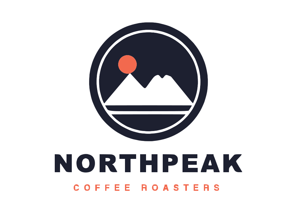
The example at the top of this page is a coffee-roaster badge with a name and tagline. It traces to 39 shapes and 832 nodes in a 27.0 KB SVG. That is a useful benchmark for what a clean, simple logo trace looks like.
Use Show points
With Show points on, every node appears as a blue dot. In a good trace, dots sit at corners and are spread thinly along curves. Dense clusters on a straight edge or a gentle curve mean the trace is following noise: try a little Blur, a higher Curve optimisation, or a better source.
Read the status line
The status line shows shapes and nodes. The shape count should match what you expect: a five-letter wordmark should be roughly five shapes, plus one for each separate dot or accent. Far more than that means specks are being traced; raise Ignore less than.
Compare against the original
Turn on Fade image to see the original underneath the vector. Check that stroke weights match, because a Threshold set too high or too low makes the whole logo look bolder or lighter than the brand version.
Clean up in a vector editor
A trace gets you most of the way. For a logo that will be used for years, a few minutes of clean-up in Inkscape, Illustrator, Affinity Designer or Figma is worth it.
- Recolour using the exact brand colour codes. Traced colours are measured from pixels and can be slightly off.
- Replace text with the real font if you can identify it. Converted type is always crisper than traced type.
- Redraw perfect geometry such as circles and rectangles with the shape tools if they must be mathematically exact.
- Align and straighten anything that should be level, since a slightly rotated source gives slightly rotated shapes.
Because every shape is its own path with its own holes, you can select a letter or the logo mark on its own without ungrouping or releasing compound paths first.
Common problems
The logo comes out inside a black box
The logo is light on a dark background. Turn on Invert image in Black & white mode, or use Colour mode with Remove background.
Letters look blobby or melted
The source is too small or too compressed. Find a bigger version first. If that is not possible, lower Threshold slightly to thin the letters and set Curve optimisation back to 0.2.
A thin outline appears around coloured shapes
The anti-aliased edge has been given its own colour. Reduce Number of colours by one so the edge tint merges into its neighbour.
The logo has a gradient or shadow
Image Tracer outputs flat colours only. Trace the flat version of the logo, then add the gradient back in your editor, or accept a stepped approximation with a few extra colours.
For settings by image type see Best settings for image tracing, and for a full logo workflow page see Logo to vector.
Frequently asked questions
Can I vectorize a logo from a tiny favicon or social media avatar?
You can, but expect to redraw parts of it. At under about 200 px, curves are described by too few pixels to be traced accurately. Look for a larger original first, even inside a PDF or an old email.
Is a traced logo good enough for print?
For most uses, yes: the SVG scales to any size without blurring. For signage or brand guidelines, spend a few minutes in a vector editor setting exact brand colours and replacing traced text with the real font.
Why does my traced logo look slightly bolder than the original?
The Threshold is including some of the soft edge pixels. Lower it a few steps in Black & white mode and compare with Fade image on.
Should I trace a two-colour logo in colour mode?
Either works. Colour mode keeps the colours for you. Black & white mode often gives slightly cleaner shapes, and since every shape is a separate path, recolouring a few of them afterwards is fast.
How do I get a transparent background?
Black & white output has no background at all: only the black shapes are drawn. In Colour mode, turn on Remove background with Separate shapes output.
Last updated